website redesign with user research + testing
This assignment was based off of an email Kent State recieved from the librarians at the Upper Sandusky Community Library in Sandusky, Ohio. The librarians were concerned that,
Our current website look is quite dated from a technological perspective, and while there is an abundance of information, it can be daunting for our users to FIND that information (i.e. it could be organized much better).
In addition to the redesign making information easier to find, the librarians had requested that any future website updates be uncomplicated so that the existing library staff can maintain the website without any extra strain on the library’s limited budget or technical resources.
problem
The Upper Sandusky Community Library’s website - redesigned after this project's completion (http://www.upper-sandusky.lib.oh.us/) needed to be updated, and where possible, the library content should be repurposed and reorganized for the benefit of its patrons. Future updating needs also needed to be taken into consideration so that the website could be maintained with limited technical resources.
Website Review
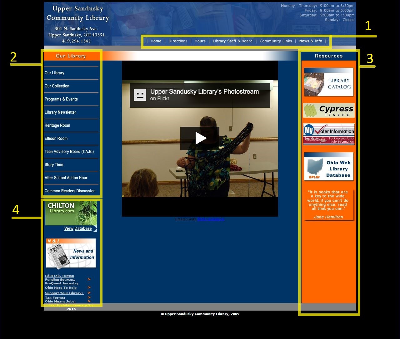
The original information architecture/organization of the Upper Sandusky Community Library showed:

In addition to the global and primary navigation options, the website offered 2 additional navigation options:
- the offsite “Resources” which include the library catalog, and
- another offsite database plus links back to the “News & Info” page.
Areas for Improvement
It was initially suggested that the lack of clearly defined style guide caused the organic growth of the website’s organization (or lack thereof) and potential confusion of its users. I noticed during a full content analysis that there were several pages with recursive and broken links:
- the “Common Readers Discussion” page linked to itself from “Programs & Events;” however, never linked to the content page and
- the “Programs & Events” page provided a link to the library catalog’s best seller list; however, that link takes the user to a page that cannot be found.
During the content analysis, I also noticed that several pages (mostly the pages for special groups/purposes, such as the “Heritage Room,” the “Ellison Room,” and the “Teen Advisory Board”) lacked a cohesive feel with the rest of the Upper Sandusky Community Library website. The lack of a style guide not only can cause organization and navigation confusion to its users, but also causes the website experience to feel disjointed as a user navigates among all the pages, such as navigation among the pages listed above.
actions
I knew that I needed to understand first, who the library was supposed to be serving and then second, review the information architecture for myself - before I could propose any solution.
Techniques Used:
- Initial Website Review to evaluate the current style and information architecture of the website.
- Ethnographic interviews to experience librarian's interactions with their patrons and understand the types of patrons they serve.
- Persona development to understand library patrons and their motivations.
- Style guide evaluation and update.
- Information architecture review and revision.
What I Did:
- I arranged some time with my local librarians Gina and Steve to complete some research into understanding how the Upper Sandusky Community Library may have been functioning and who its primary patrons were.
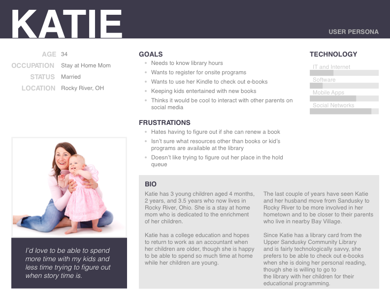
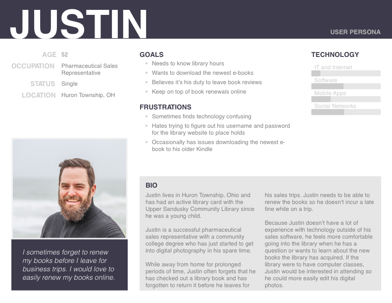
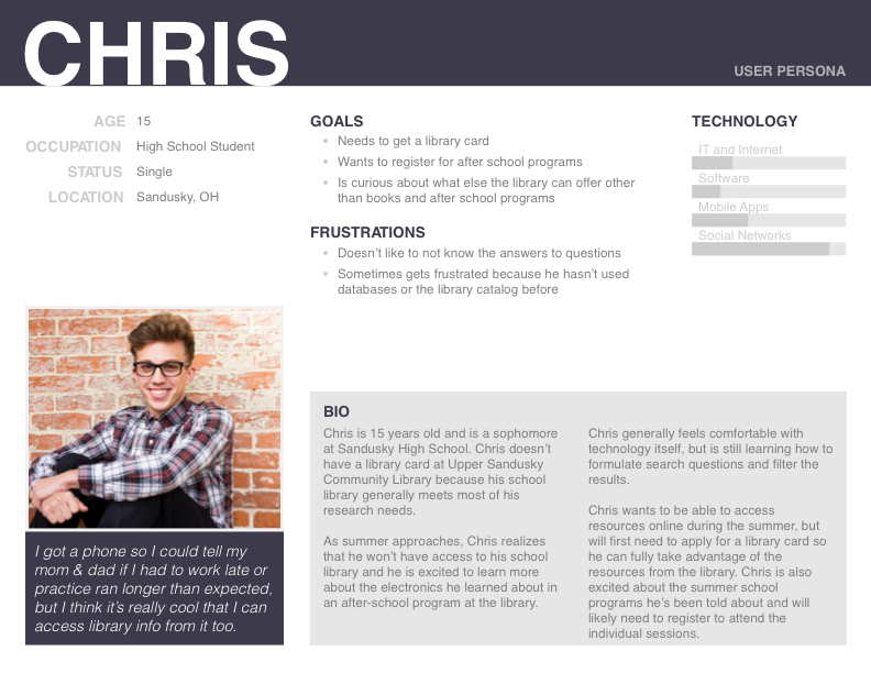
- Once I'd finished my initial round of research, I worked on developing persona primary and secondary personas for the primary library users.
- After I developed the personas, I evaluated what tasks they would be most likely to participate in, and created a matrix to display that information for ease of comparing motivations between personas.
- From persona development and task comparison, I moved to evaluate the current information architecture and develop a strategy behind the website's organization to inform the navigation structure and future content additions.
personas + task evaluation
Based on the information I collected from my interviews with Gina and Steve, I figured that I had 2 primary personas and 1 secondary persona who were regularly looking to accomplish 6 tasks between them.
Primary Personas


Secondary Persona

Task Evaluation
Once I had an idea about who my library users were, I started to get a feel for what they would use the library website for:
| Task | Persona | ||
|---|---|---|---|
| Katie mom, with kids |
Justin single, without kids |
Chris teenager, high school student |
|
| High Priority Tasks | |||
| Library Hours | Yes | Yes | Yes |
| Register for Programs | Yes | Yes | Yes |
| Search the Catalog | Yes | Yes | Yes |
| Medium Priority Tasks | |||
| Renew Books | No | Yes | No |
| Place Holds | Yes | Yes | No |
| Check Out Social Media | No | No | Yes |
| Low Priority Tasks | |||
| Technical Support | Yes | No | No |
| Discover Other Library Resources | Yes | No | Yes |
| Leave a Book Review | No | Yes | No |
additional project work
After I finished my initial research, it was time to evaluate the information architecture and content strategy.