website redesign with user research + testing
This assignment was based off of an email Kent State recieved from the librarians at the Upper Sandusky Community Library in Sandusky, Ohio. The librarians were concerned that, "Our current website look is quite dated from a technological perspective, and while there is an abundance of information, it can be daunting for our users to FIND that information (i.e. it could be organized much better)."
In addition to the redesign making information easier to find, the librarians had requested that any future website updates be uncomplicated so that the existing library staff can maintain the website without any extra strain on the library’s limited budget or technical resources.
problem
After completing my research into library patrons and website use, I knew that improving the information architecture strategy was necessary to improve the library website as a whole.
actions
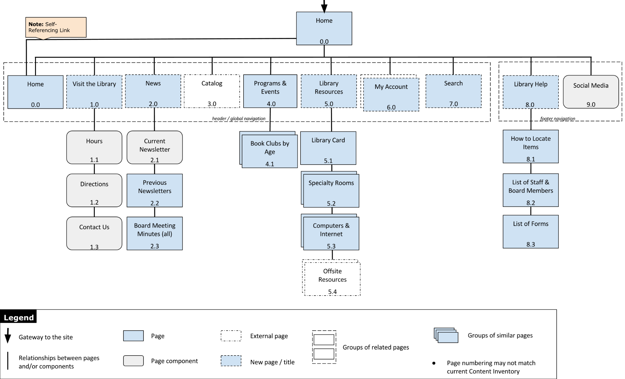
I spent time to document the current page relationships and created information architecture diagrams with Visio to ensure I understood the current site organization.

As part of the site review process, I used Excel to document and evaluate content and its organization.
And finally, when I had some ideas about how to improve the information architecture, I used Treejack (an information architecture testing tool) to confirm information is where users expect to find it in a website's hierarchy.
Treejack Test
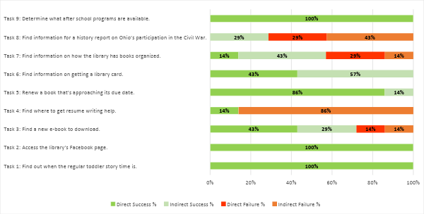
The proposed sitemap was loaded into Treejack and 9 tasks were created to exercise the new website organization.

Proposed Organization Scheme
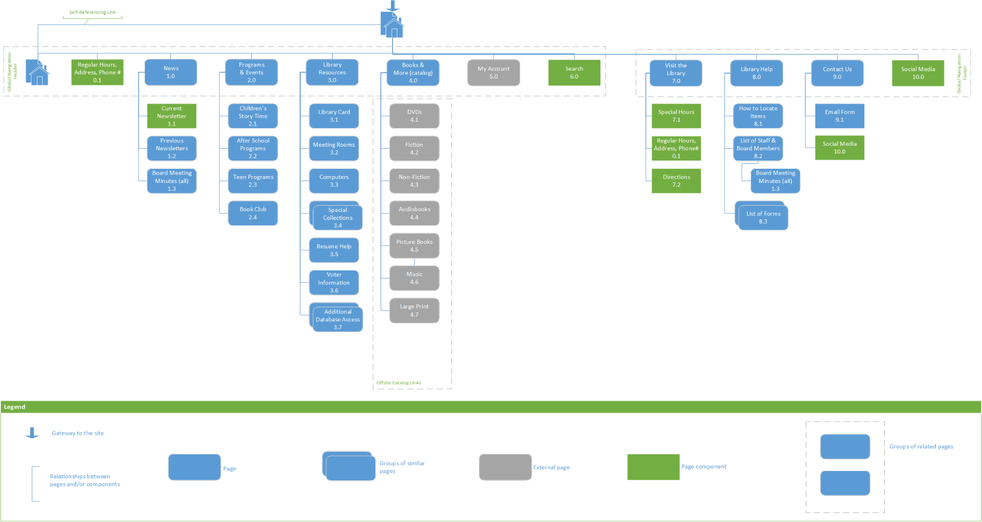
After exploration of different navigation structures, I proposed that a hybrid topical and task-based organization scheme (with some audience-specific content) would work best for the Upper Sandusky Community Library’s redesigned website - and help the librarians maintain the website with ease.
According to my research, most library patrons want to:
- find when the library is open,
- place a hold for a book,
- renew an already checked out resource that is approaching its due date,
- download an e-book,
- register for events, and
- search the catalog.
New Organization Strategy
Since the library patrons' needs are varied, a hybrid organization scheme remains the best option for the website.
The Challenge
The challenge with a hybrid organization scheme is to keep each topic or task large enough to contain more than one page, but small enough to not require the user to have to search through multiple pages to find what information they seek.
Addressing The Challenge
This challenge can be met with multiple entry points to the same page; however, the duplicated entry points must make sense, and should not be so superfluous as to be difficult to maintain all the references.
When new content is needed, the librarians should first determine if existing content should be repurposed to include the new content and if a new page is needed, reference the above user tasks and the site map/blueprint to determine the best fit for the new content.
Testing A New Site Map
Once I had my proposed new information architecure and strategy defined, it was time to test each with potential users.
To test the new content organization, I used my Content Spreadsheet to evaluate content as seen on other library websites against the New Organization Strategy; once it was unambiguous where a new page would be added, I considered the strategy and new content organization refinement complete.
Using Treejack, I was able to poll a representative sample of library patrons to test my proposed organizational changes.

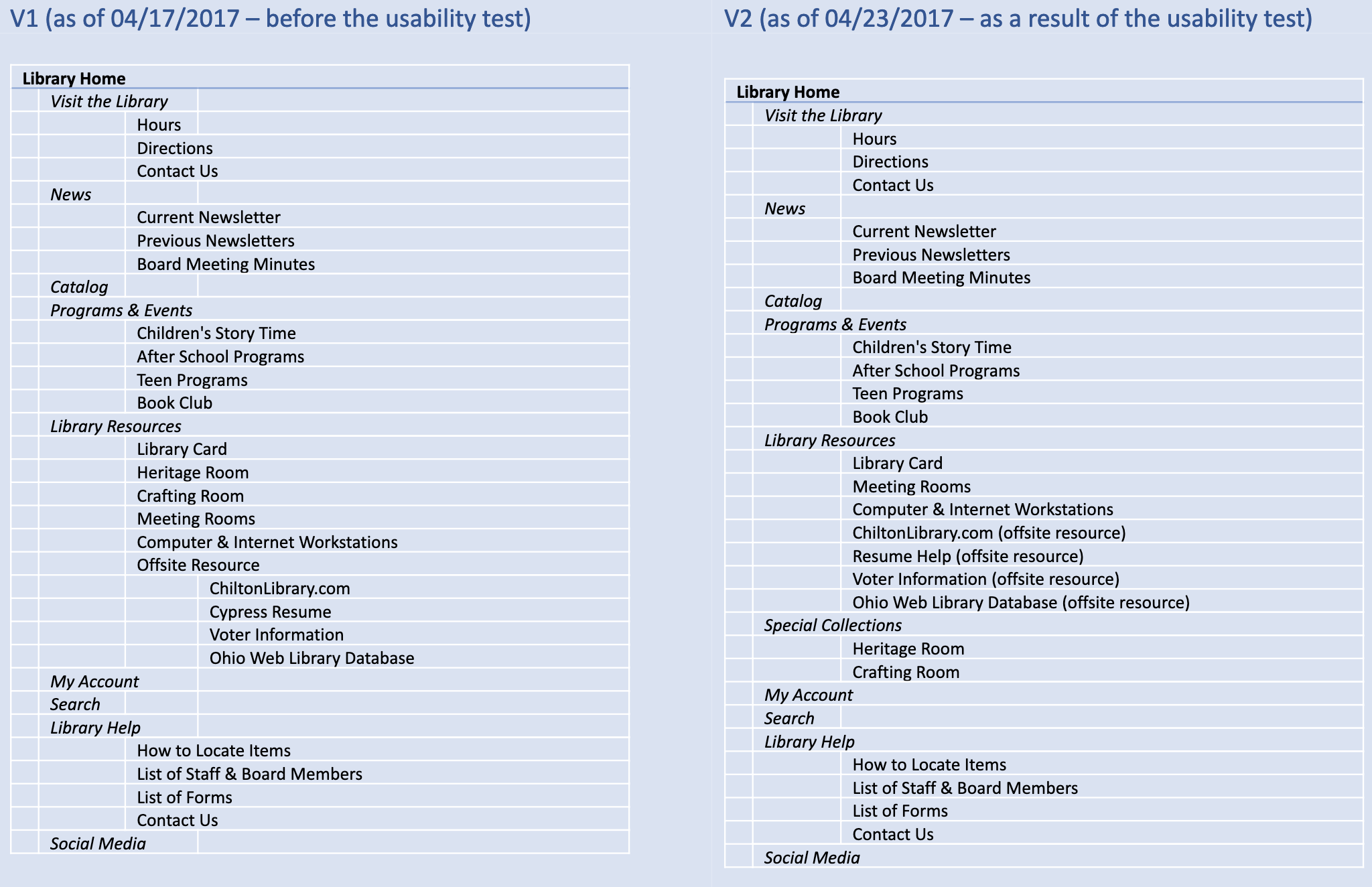
- V1 Before Testing
- V2 Changes per Testing
results
Using my representative sample of library patrons and updated site map, I was able to start development of wireframes that would allow me to further test the new website layout and content organization.
