website redesign with user research + testing
This assignment was based off of an email Kent State recieved from the librarians at the Upper Sandusky Community Library in Sandusky, Ohio. The librarians were concerned that, "Our current website look is quite dated from a technological perspective, and while there is an abundance of information, it can be daunting for our users to FIND that information (i.e. it could be organized much better)."
In addition to the redesign making information easier to find, the librarians had requested that any future website updates be uncomplicated so that the existing library staff can maintain the website without any extra strain on the library’s limited budget or technical resources.
background
The Upper Sandusky Community Library’s website - redesigned after this project's completion (http://www.upper-sandusky.lib.oh.us/) needed to be updated, and where possible, the library content should be repurposed and reorganized for the benefit of its patrons. Future updating needs also needed to be taken into consideration so that the website could be maintained with limited technical resources.
Previous Work
- Research
- I needed to understand library patrons and tasks that they needed to complete on a library website.
- Information Architecture + Content Analysis
- Before proposing an updated design, I needed to evaluate the purpose of the library's website and ensure I understood how it was going to be used.
actions
Using the results of the Treejack tests, I first sketched wireframes with paper + pencil to test some ideas and then created wireframes with Axure RP that implemented the new information architecture and content strategy.
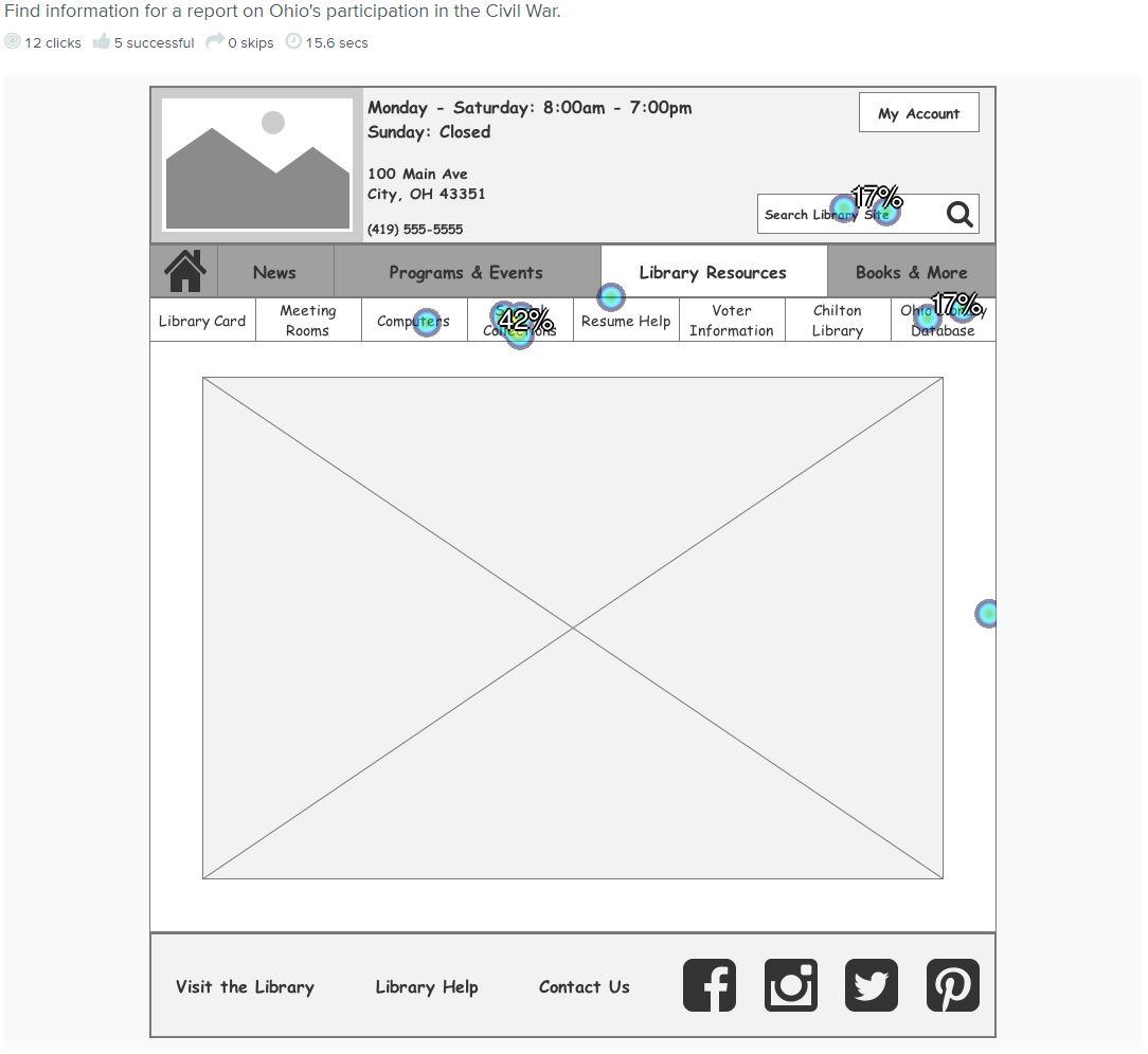
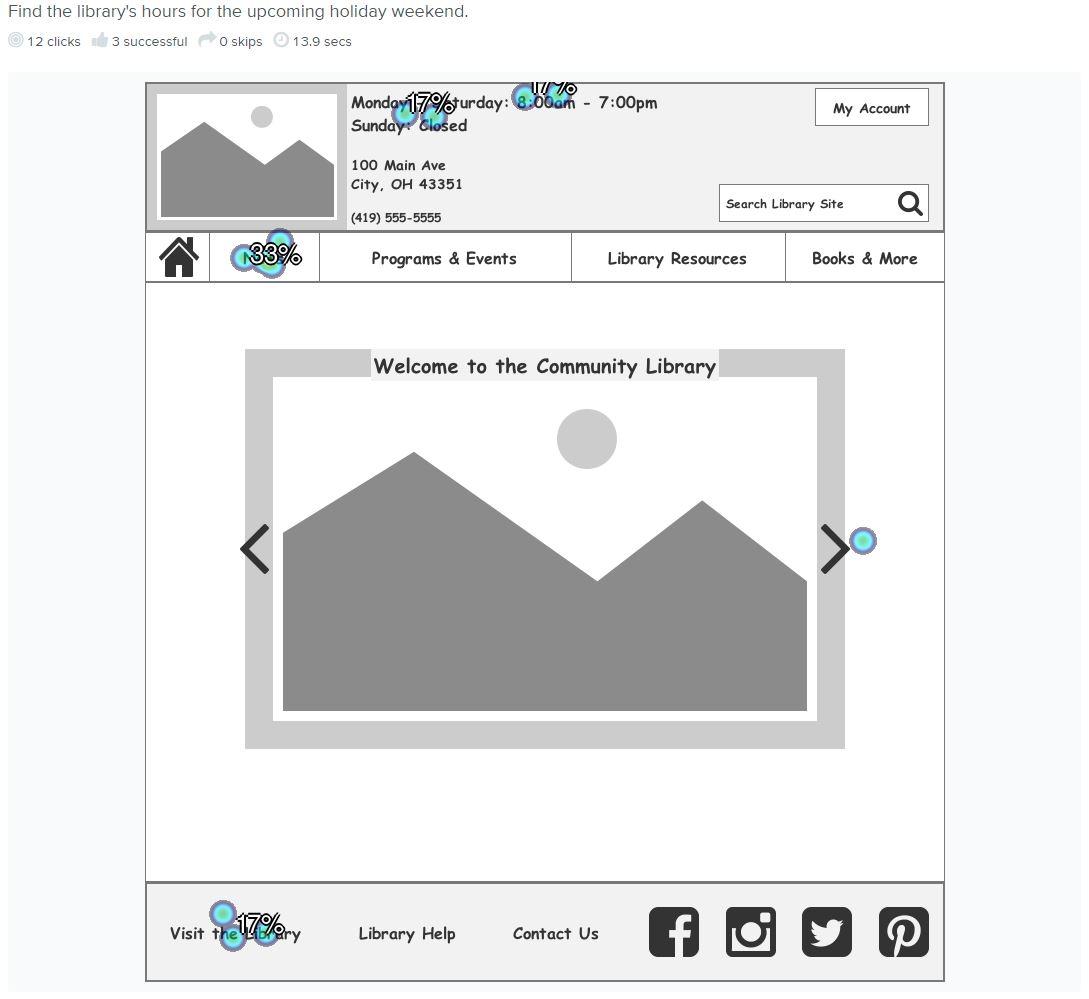
Since I had built-in additional testing time to the project timeline, I was able to use Chalkmark with potential library patrons to evaluate the proposed site's navigation and content findability.
results
After thinking through and evaluating the needs of the library patrons for some time, I developed a focused hybrid organization scheme of topical and task-based organization and navigation to help library patrons utilize the Upper Sandusky Community Library - and librarians maintain the website for years to come with limited development resources.
Chalkmark Results


lessons learned
Usability testing is important. Even though I thought I had initially created a pretty solid information architecture, with the help of usability testing, I discovered where improvements still needed to be made.
I also learned that it's possible to keep pushing for more usability tests, and while they're important, it's also important to actually get the product to market and evaluate the success of the new site with pre-defined key performance indicators (KPIs), metrics, and user feedback.