problem
So rarely does one have the opportunity when taking over an existing product to evaluate its information architecture. And since I was responsible for adding a whole new component to the feature set of the OnShift Engage product, I needed to make sure that I was adding the features in an easy to access location where they would be regularly used.
One challenge that often presents itself is how a designer is supposed to manufacture the time to do user research and testing calls with customers... and convince management that the time spent on the research and testing is worth while.
As I've been working at OnShift, the biggest challenge that I face with every project is how to create time for research - and in the case of the survey platform, since I built research and user testing into the scope of the project - with product approval - at the beginning of the project, the challenge was finding a group of customers who were willing to help with a usability study.
actions
Thanks to both my product and customer success teams, I was able to find a group of wiling customers and set up phone calls with them individually for a card sort + usability study - and to ask them if they'd be willing to serve as pilot customers as we developed and released this new feature.
Each call started with a product feature-set overview from my Product Owner and from there I would take over for the open card sort exercise followed by the usability test of mid-level prototype.
card sort
Using RingCentral with a Treejack study open, I loaded the study with 30 cards (what I explained to the customers were "Engage Widgets - a small thing that the product does or may do in the future") and asked my participants how they thought about the Engage product with resepect to the widget list they had before them. To minimize complexity, I used RingCentral and asked my customers to take control of my screen so that I could see what they were doing and ask their reasons for groupings or titles as needed.

With only 1 technical difficulty with my first participant, the other 2 calls went without a hitch and I was able to get enough information to challenge some of the assumptions we as the delivery team had made during story mapping and my initial information architecture decisions.
usability test
The usability test I designed was minimally interactive with fully functional navigation so that I could evaluate the assumptions I had made based on information from my Product Manager and the initial generative user interviews.
Continuing to have my participants control my screen, I brought up an InVision Studio prototype and introduced the purpose of the activity as understanding how they would use the product and explained that in conjunction with the information from the card sorting exercise, I'd better be able to understand how they current use the product and how we could best meet their needs with our future development as well.
results
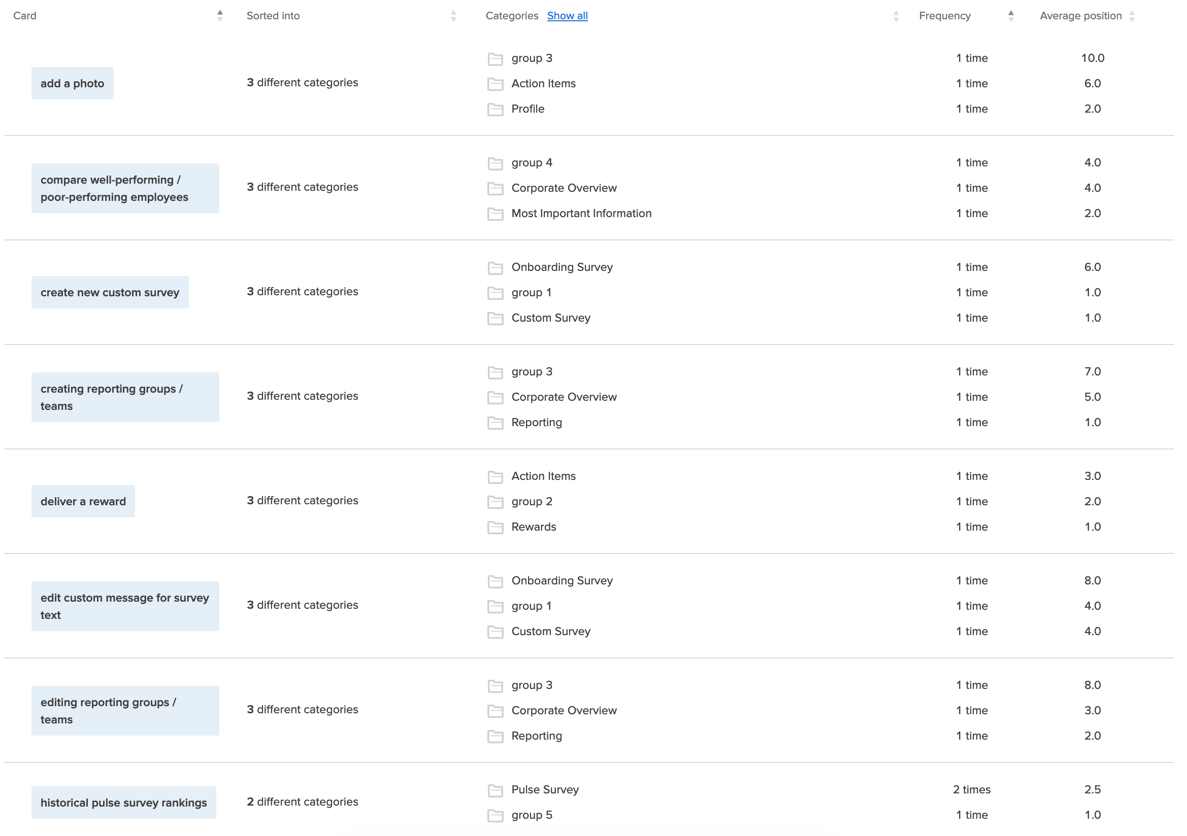
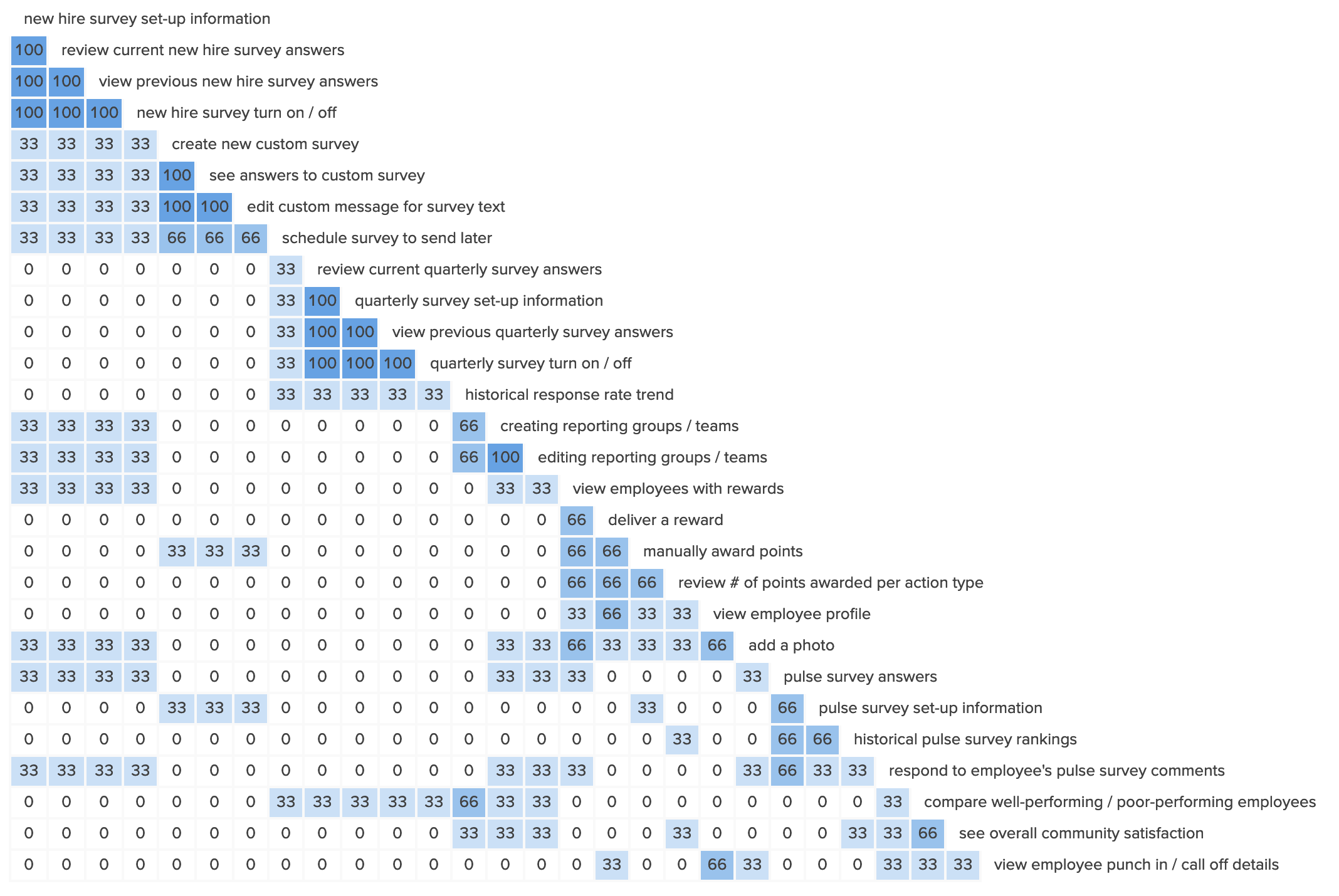
I was so excited that I was able to get a card sorting exercise into my customer calls because it was something that I was originally told we shouldn't need to do because we already knew everything about our customers - and based on the results from the card sort as shown below - there was still plenty to learn.

Based on my initial information - and the current application set-up - it made sense to have all settings on one page with results on their own unique pages. However, based on the information from the card sort and the usability study - it was obvious that the folks who would be using this feature set, didn't think that way and instead thought about the information all grouped together for each survey type.
lessons learned
I'm fortunate that I was able to work the card sort into the usability study: I was able to show the value of questioning our assumptions and validating our experiments before fully developing and releasing a product to the world.
I was excited to be able to report to my EVP of Product that we learned something from the card sort + usability test and that asking for this type of help & customer feedback wasn't a waste of time because we now knew that what we were working on would be useful and used by our customers.
The challenge will be to reinforce the idea of this useful UX tool without being overbearing - the key, I believe, will be to continue to work with my Product Manager and Product Owner as we scope out new projects and build in research, as I wrote about on Medium.