evaluating arduino.cc information architecture
This assignment was to develop an evaluative blueprint of selected portions of the Arduino website and to use that blueprint to analyze and critique the information architecture with the intention of suggesting improvements for the information architecture and content organization.
problem
The arduino.cc website contains a vast quantity of information and support; however, since the website is lacking a site map, it can be challenging to navigate from a specific support page to purchase.
My challenge was to review the existing content + architecture to determine if the current organization could be improved, and if it could - suggest improvements and explain how my suggestions would improve the site.
actions
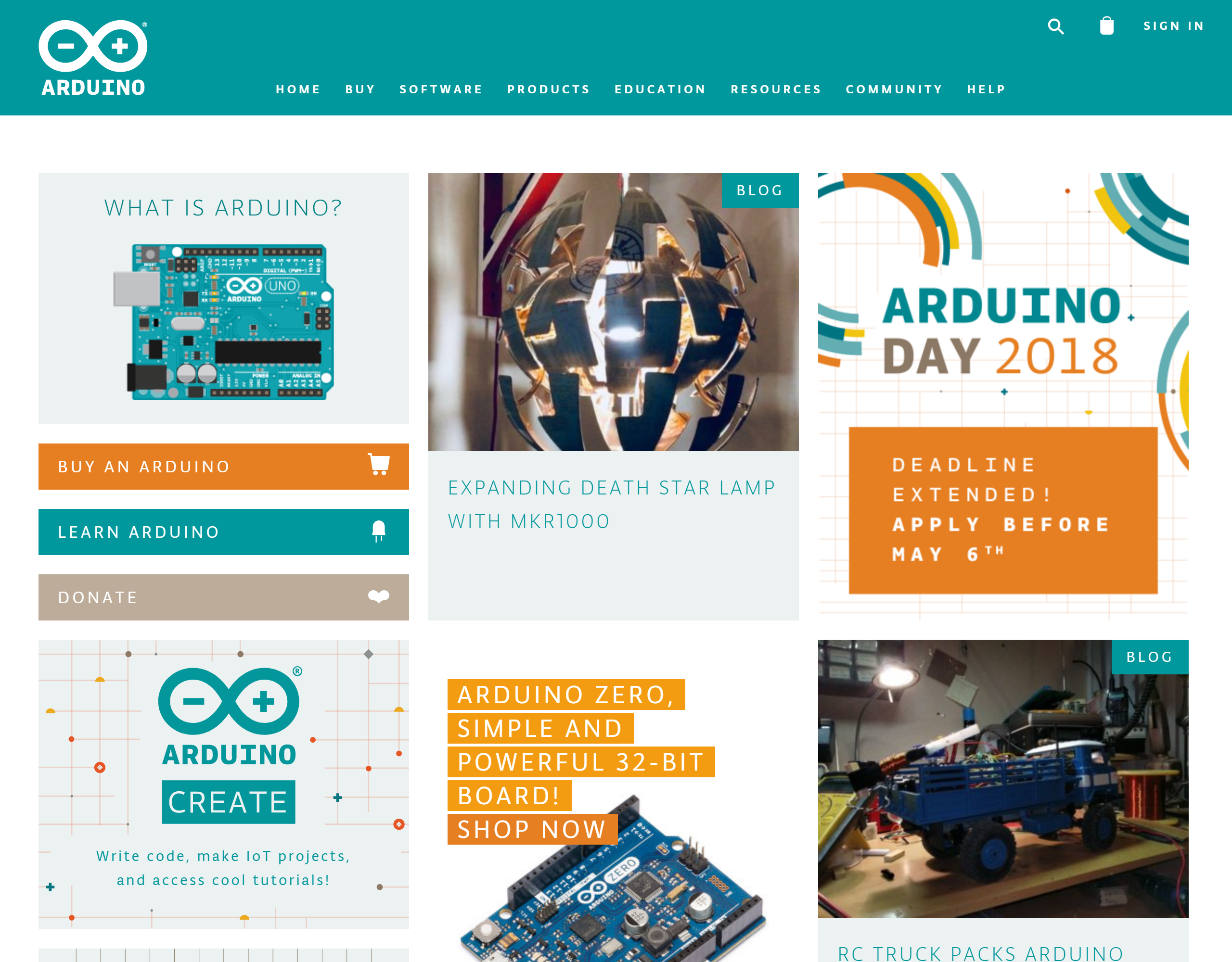
I clicked through each page of the arduino.cc website to explore and document the current information architecture so that I could understand the website organization before proposing any changes.
Tools Used & Why
- Paper & Pencil
- Used to sketch page relationships and information architecture diagrams.
- Google Draw / draw.io
- Software used to electronically diagram relationships between pages and explore the website's
information architecture for the project's final report and presentation.
Useful for sending legible diagrams to other people in case of review.
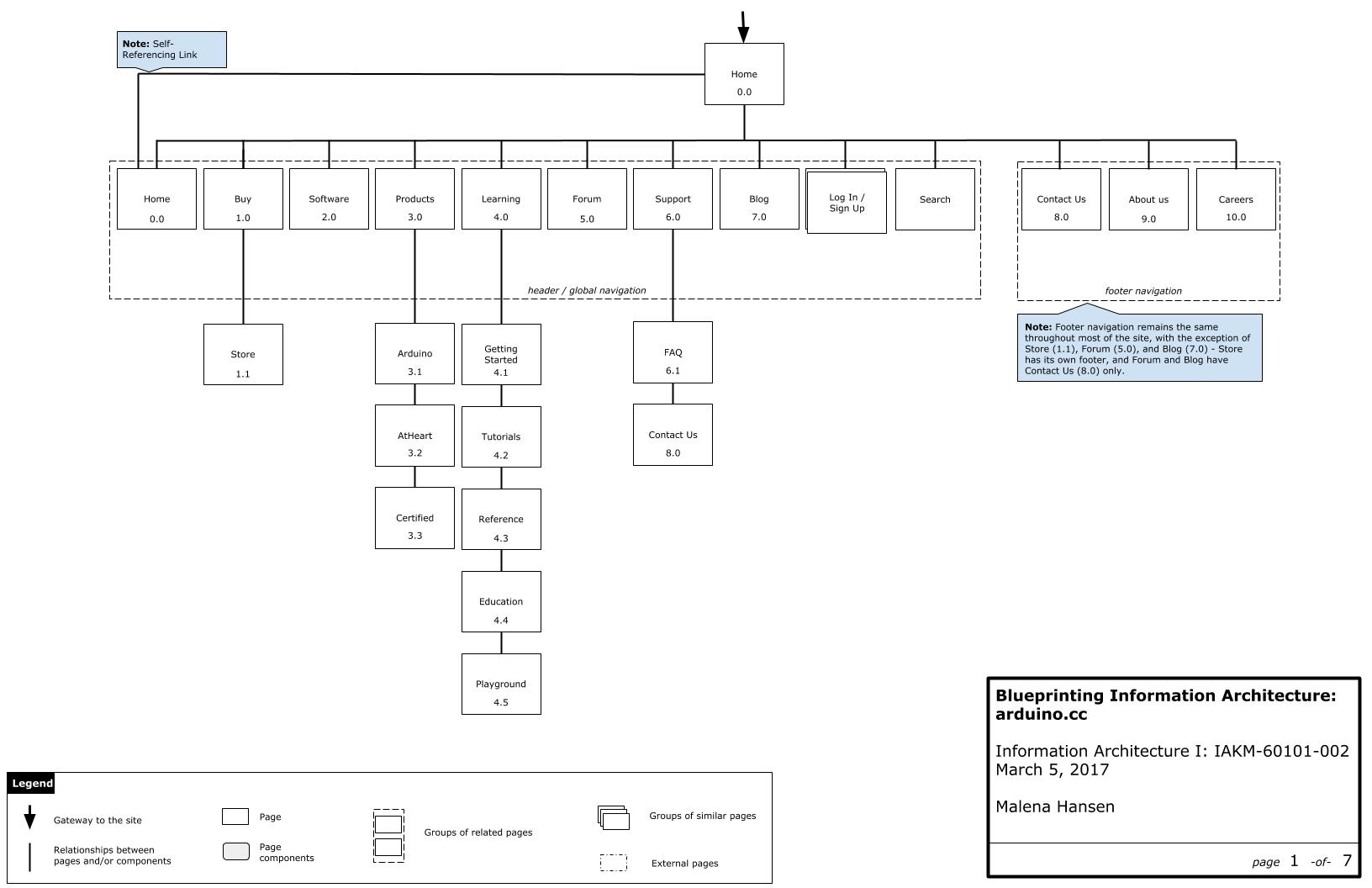
As I was clicking through arduino.cc, I started taking notes... and then realized that the site was a spider-web of links and different information architecture patterns.
The best thing for me to do would be to document the current structure and add suggestions to that document so any website updates could be organized, and possibly made over time as needed / with other site updates as non-breaking changes.
results
The "current" information architecture is up to date as of March 2017. Some things may have changed since then.
What Should Be Improved
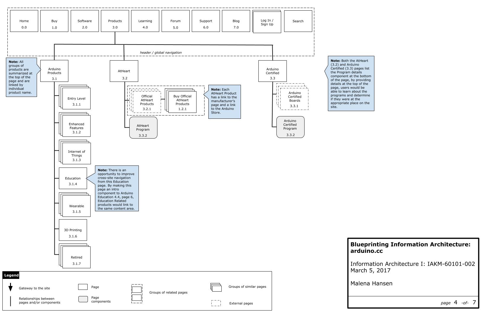
The collection of arduino.cc sites contains a vast amount of information; however, with its mix-and-match approach toward information architecture and knowledge management, it can be challenging for a user to find information at first attempt. I've charted my suggested improvements to help users find information in a easier to navigate IA.

What Works "Well"
There is an enormous amount of information available on the site with appropriately matching metadata.
Searching generally works well and resources are approachable with plentiful inspiration. Navigation menus are broad and deep enough without being overwhelming.
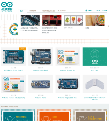
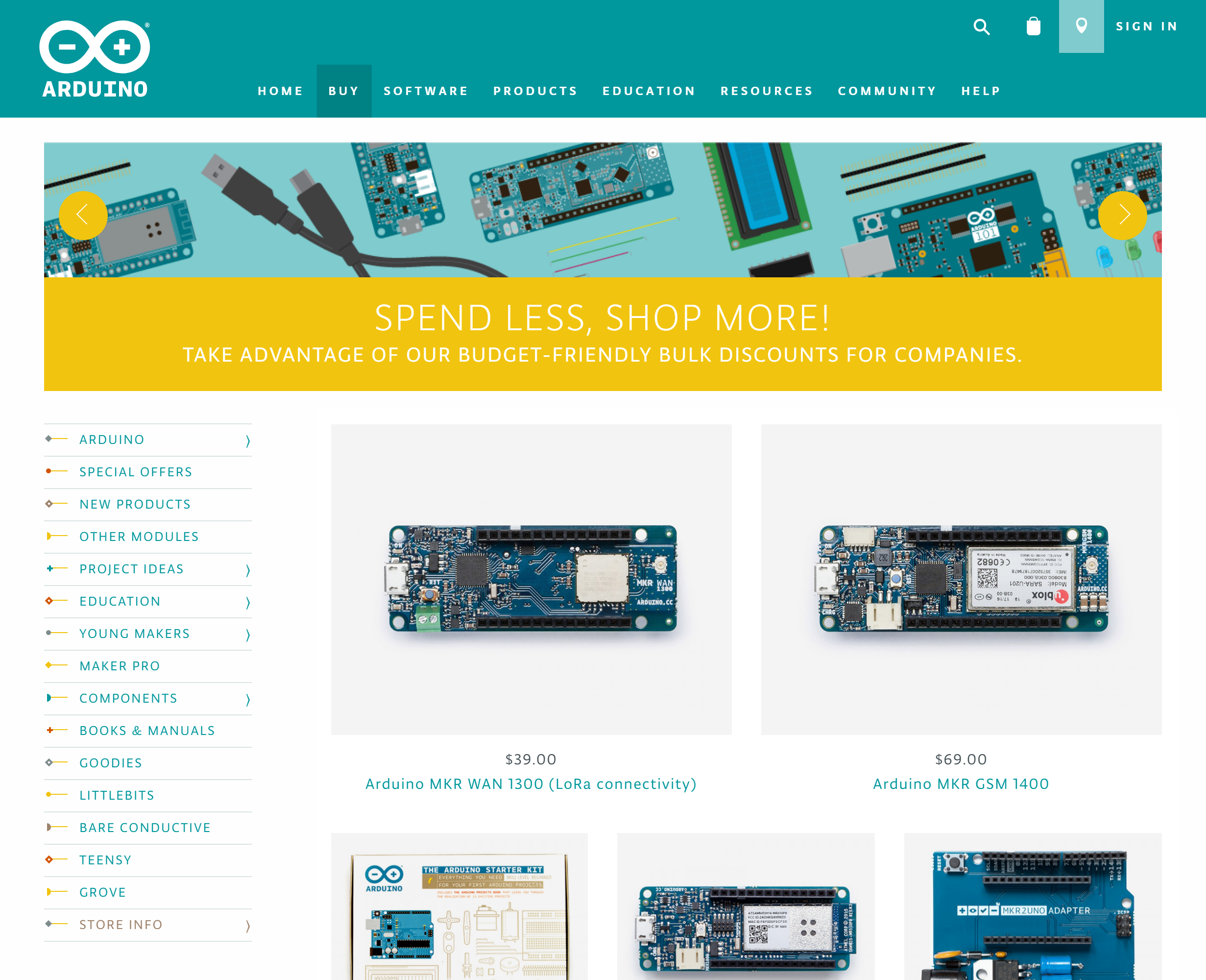
The main Store page also suffers from lack of supporting navigation, seemingly the only option to filter items in the store is to use the main navigation menu under Buy, as shown above; however, the Featured Collections below the “fold” seem promising as a topical navigation scheme.
Though store-usa.arduino.cc isn't perfect and suffers from lack of either task or topical navigation schemes as a whole. Implementation of topical navigation would greatly assist users who are attempting to purchase an item based on project.
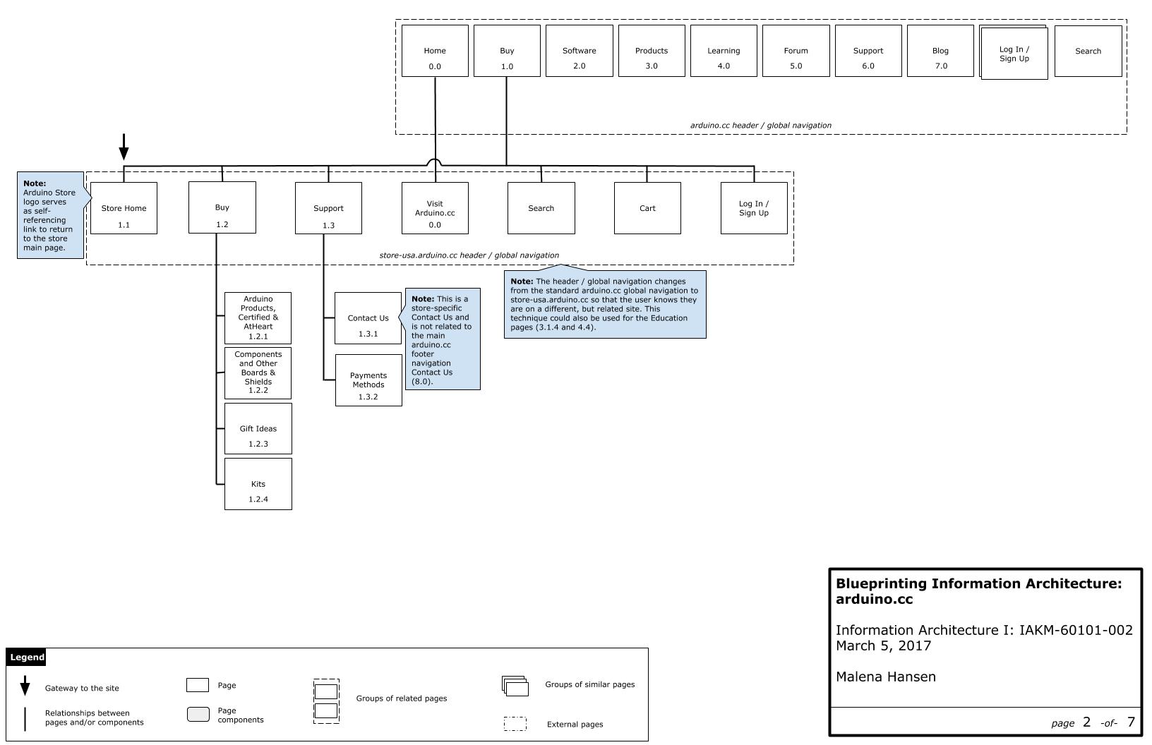
lessons learned
If a website, especially a commercial website, doesn't have a content strategy or an information architecture strategy and is allowed to grow organically, it will be a challenge to update its organization - or even track its own internal links.